Google Maps
MOBILE APP CASE STUDY
Google Maps, by Google, is a go-to for navigations, restaurant reviews, and real-time traffic updates. With a massive user base already loving the app, improving it was no small journey, but we were ready to bring the app to a new destination.
Our team of 3 had a goal: to enhance navigation through the heartlands of Singapore — all within four weeks. As a UX Designer, I steered the user research and testing while also helping with the design prototypes in Figma.
PINNING THE PROBLEM
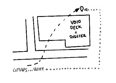
In Singapore, where every minute counts and the heat can be relentless, finding the fastest route is crucial. However, users were often frustrated with Google Maps', which lead them on longer paths than necessary. In a hot city where efficiency is key, this was a real pain point.

HOW DID WE LAND ON THIS PROBLEM?
To gather quick, early feedback and identify usability issues, I led a hands-on heuristic evaluation with the team. We assessed the app separately and then came together to analyse and summarise our findings. This revealed specific usability issues and their impact on the overall user experience.
Building on these insights, I sought firsthand feedback through a survey and interviews, to listen to users' experiences with the app. In these interviews, we also captured how often they used it, why they turned to it, and what features they wished it had.
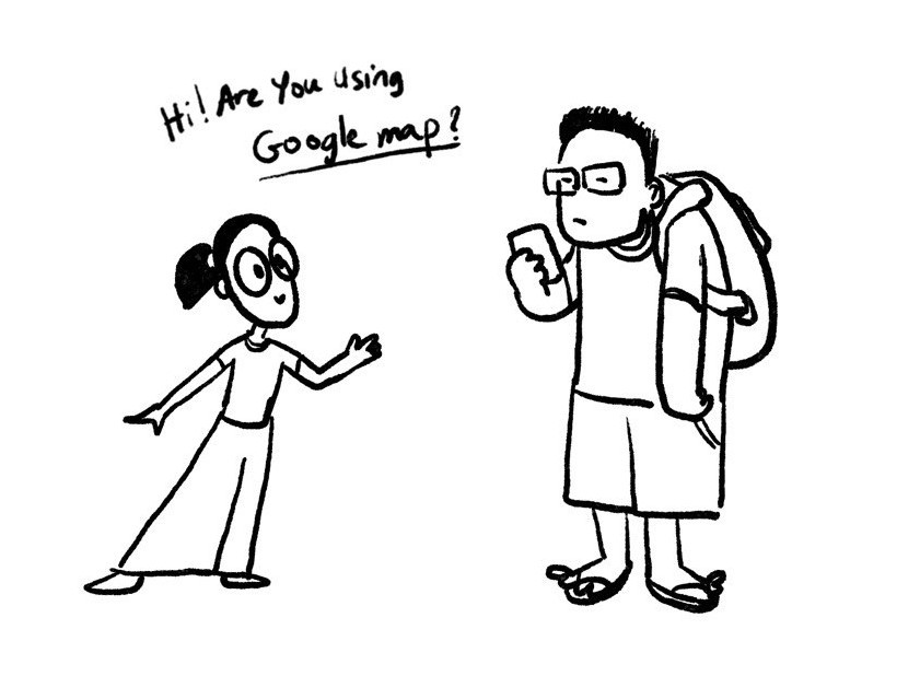

From the interviews, it became clear that navigating Singapore’s heartlands was a common frustration for everyone, often due to those annoying extra steps and unnecessary detours.
WHO HELPED MAP OUT THIS PROBLEM?
We decided to focus on regular Google Maps users. By delving into their experiences, we identified two distinct target audiences. From this, our team crafted two key personas: primary (red) and secondary (green). Having two personas helped us grasp the subtle differences in user needs, even with similar shared frustrations. This also helps guide our design improvements moving forward.
BEFORE WE NAVIGATE TO THE SOLUTIONS
I mapped out the current task flows for our users, breaking them down by the two personas. This helped the team understand how users navigate the app and the steps they follow to reach their goals, pinpointing pain points, and identify opportunities for optimisation.
NOW, ITS TIME TO PLOT OUR PATH
With everything we’d uncovered, we were able to zero in on the problem, breaking it down into five key areas that we could tackle head-on.
1
Suggested directions aren't always optimised
—
Google Maps favors main roads, overlooking Singapore’s small roads and building shortcuts that could save time
2
Customising routes
isn’t possible
—
Google Maps prioritises speed, but users might prefer a route that's less crowded or involves less walking
3
Information feels cluttered
—
Unnecessary details like the temperature clutter the screen, making it hard to find what you need
4
Saving locations is a complicated process
—
It requires too many steps, and there’s no quick-save option from search or history
5
Finding nearby ammenities isn’t easy
—
Google Maps tends to show familiar spots instead of helping you discover new places nearby
EMBARKING ON THE JOURNEY
We kicked off by sketching wireframes—quick, efficient paper prototypes that let us visualise ideas and test how users interacted with our concepts right from the start. Here's some of the sketches!
As we refined our designs, I conducted usability tests, and decided to mix both new and previous testers. Familiar users revealed how changes matched their expectations, while new users offered fresh perspectives. This approach helped us spot patterns, minimize bias, and gain a comprehensive view of the design's effectiveness.
For a deeper look into my testing process and findings, you can explore the full documentation here.
TAKING SOME DETOURS
As we navigated through the design process, user feedback and testing outcomes prompted us to pivot and adapt our strategies. These unexpected detours ultimately led us to more refined, user-centered solutions. Here's one example of how we adjusted our course:
DESTINATION: THE FINAL EXPERIENCE
Here’s the final prototype, a result of 4 weeks of our hard work.
Feel free to explore it and experience the improvements firsthand here!

LOOKING BACK ON THE JOURNEY
We faced plenty of challenges and unexpected obstacles, including a tight timeline and team health setbacks. Despite initial concerns about the project's scope, we managed to cover most of the critical screens in Google Maps, addressing the key pain points above. Our team’s collaboration and commitment shone through, even when differing opinions caused a few bumps along the way.

While some design elements, like font size and visual intensity, needed more tweaking, the overall outcome was a success. We received positive feedback and significantly improved users' experience navigating Singapore's streets. Despite challenges beyond our control, we focused on what we could change and delivered a polished final product. This project truly tested our resilience and adaptability. Thank you for going through this journey together, team!
Thanks for stopping by! Feel free to explore more
New
Kaki
UX INTERNSHIP AT
GOVTECH SINGAPORE
How I approached the discovery phase and delivered distinctive contributions
© Nicole Lee Wen 2024
